Thursday, September 26, 2013

Houzz Feature: My Garage Conversion

Check out my garage conversion featured on Houzz.

source

I know garage conversions are somewhat controversial and I explained in my interview that our garage was unusable as a place to park cars because the access to it no longer existed.  Unfortunately the editor omitted that bit of vital information, hence some of the comments.

Here are the pictures that I submitted to Houzz.


Garage before (incase you couldn't tell)!


garage before


Houzz also want to do a house feature.  I don't think I dare.  The comments can almost be as nasty as on Apartment Therapy.

Speaking of AT, today is the last day to vote for my room in the Room for Color contest.  I'm currently 10th.  I need to be in the top 5 to contend for the prize.  There's some great entries this year, as well as some not so great.  The top two rooms in my category have definitely been promoting the heck out of their rooms on Facebook which is part of the contest.  Fortunately this year, the judges get to pick who wins.  Lets hope they pick a good one; it definitely won't be mine ;(

*NEWSFLASH* - just found out that Abigail Ahern is going to be on the panel of judges for the AT Room for Color Contest.  I wouldn't be surprised if another judge will be Emily Henderson.  I'm kind of bummed they didn't judge the past two competitions this way.  I still think my room is pretty good but the scores on everyone's entires are pretty low this year, and you'll notice that the rooms that have the highest scores have the highest number of Facebook shares.  I deliberately didn't want to bug my friends this year for votes and only shared it twice, but now I'm rethinking that strategy.  So, if you like my designs, please vote here.  Thanks!!!

Friday, September 20, 2013

Wingback chair makeover Part 2

Sorry, but this post isn't going to contain any pretty pictures.  But it is the next installment on how to reupholster a wingback chair.

An important thing to remember is that to take lots of pictures so you know exactly how to reconstruct the chair.  Also important is to keep the old fabric that you pull off and label it.  You will be using this fabric as a template for your new fabric.


Don't forget to also label which side is up.

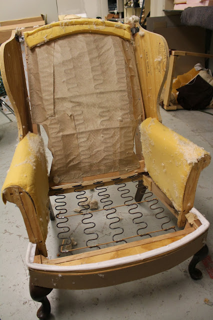
Once you strip all of the fabric and batting off you are left with something like this.


You want to check the sturdiness of your chair to see if you have to do any reinforcements.  Sometimes you'll want to tighten screws or use nails.

Check the foam to see if it's still good.  You can reuse some of these things.  The decking (padding on the seat bottom) was still ok but I decided to add a little bit more padding for extra cushioning.


 Now comes the tricky part; deciding what fabric to use.

DwellStudio Vintage Plumes in Jade

DwellStudio Peony 

DwellStudio Peony and DwellStudio Fretscene Canary
Any guesses as to which fabric I chose.  Stay tuned, all will be revealed next week ;)

Tuesday, September 17, 2013

Wingback chair fabric choices

It's time to think about what the heck I'm going to recover the wingback chair in.  I definitely want something with a pattern, but do I go graphic, or do I go organic?

For some reason a little voice inside my head has been telling me to use DwellStudio's Vintage Plumes fabric.  Yes, birds again!  I've seen this fabric in person and it is really pretty; a sort of modern take on chinoiserie.  It's not exactly like my peacock bedding but close enough that I could put them together in the same room.  But that shouldn't matter, because I'm not sure if I'm going to keep the chair once I finish it.

Here's some pictures of furniture upholstered in the Vintage Plumes fabric.


I've seen this fabric for sale at my local Calico Corners.  You can buy it online for around $60 a yard!  And considering that I would need at least 5 yards of it, well that kind of settles it then, doesn't it?

Still not to be deterred, I decided to make the trip to Calico to see if they had it for less.  On the way, though, I stopped into Hancock Fabrics to see what selections they had.  It's a bit hit and miss at Hancock; you never know what you're going to find.  I was surprised to see Thomas Paul fabric there (the same pattern as my famous office chair!).


It's not the same fabric but the print is the same.  I think I'm over it though.


I do think that the yellow above could look nice and fresh.  If I was to use the two fabrics, I would put the floral on the inside of the chair (i.e. chair seat and back and arms) and the graphic print I would put on the outside of the wings and arms and the back (hope that makes sense).  Yes, I'm up to my old tricks again of mixing graphic and organic.  The price for the above fabrics is $24.99 a yard, but it is currently 50% off.  So I could potentially reupholster for around $60.

Next stop was Calico Corners where I was surprised to see that they don't carry DwellStudio anymore, or many Thomas Paul fabrics for that matter.

I did see this Dixon slub on clearance.  I love the hex print, very David Hicks, but not the colour.


A client had asked me to source some kelly green imperial trellis wallpaper for her, so when I saw this fabric below it totally reminded of that style.  The green and white would be really fun, but the material wasn't strong enough for upholstery use.


So I totally struck out at Calico, but I did have one more place in mind.  One of the ladies on my upholstery course mentioned a fabric store called Home Fabrics.  She said it was way cheaper than any other fabric store in town and often had close-out fabrics for really good deals.  Let me tell you, I was skeptical; especially when I first walked in.  Rows and rows of not particularly inspiring fabrics and a buzzing overhead light that really started to get on my nerves.  Just as I was about to leave, you wouldn't believe what I spied.  Ok you've probably guessed it by now, and I swear I didn't make this up.  


Seriously!  It's the power of The Secret.  Now if only it would work for me getting a gorgeous colonial home that I dream about.

Was it too good to be true?  Did they have enough fabric on the roll?  I scooped up the fabric, clutching it tightly in my hands.  Nobody's going to be stealing my find!  Not that anyone would because there was only one other person in the store.  And why am I being so dramatic?  Anyway, turns out there is 4 3/8 yards.  Let's hope it's enough.  Total price, just over $60.

Having said that, still not sure I'm going to use it or go with the yellow.  

Here's the chair as a reminder.


What do you think? Graphic, floral or both!

Friday, September 13, 2013

Wingback Chair Makeover Part 1

So I'm finally getting back to doing some DIY.  I know, I know, I've been very lazy in that department, but that all changed last night when, on a whim, I signed up for an intermediary upholstery course through the community ed program (despite the fact that I hadn't taken the beginning course; hope I don't regret it).

During my thrift store excursions I'm always coming across upholstered furniture that has seen better days and often I think, wow, wouldn't that look great with some cool new fabric? However, although I've upholstered a few things before, I've never taken a chair down to its bare components which is what is often needed with thrift store finds.

But what should I upholster?  Fortunately, I had a thrift store wingback chair that I had previously tinkered with but never finished.  I had been meaning to donate it back, but hadn't gotten around to it.  Anyway, here is how it started.


The instructor warned me that I was probably taking on a more difficult upholstery project than a beginner should consider.  But I'm up for the challenge.


The first step is to strip all of the old material off.  Easy peasy NOT.  Well it's not difficult, but it is time consuming as you have to remove a gazillion staples.  Luckily I had lots of tools to aid me in this process.


I scoffed at the instructor when he told me it would probably take two or three sessions to do this stage.    Well, he wasn't wrong! Three hours later, and all I had managed to remove were the back, wings and sides.  However, I did find 60 cents in loose change and a couple of tic tacs.


And this is where I left it.  Doesn't it look like it has ears?

Stay tuned each week as I update you on my progress.

And here's a pretty upholstery piece that one of the ladies in the class has been working on.


It's going to be fabulous!

Thursday, September 12, 2013

Room for Color 2013

So I entered Apartment Therapy's Room for Color Contest again!  Yes, I know, am I just a sucker for punishment or what?  Well, anyway, it doesn't look like I'm going to do nearly as well as I have the past few years.  Unfortunately the photos I submitted don't really show the whole room and quite a few people have called me on it.  I honestly must have been having a brain fart (my son's favorite term) when I submitted the pictures.

So for all the people who have asked in the comments on AT to see more pictures, I hope these help.


You're probably thinking, that's a strange ceiling?  Yes, we have a balcony that looks down from upstairs into this room.  This room, which is the family/living room, is in the middle of the house.


The picture above shows some of the cool original features of the house.  We have 2 massive working pocket doors, and believe me, they come in handy when Roman's banging on the drums.


This window is actually bowed.  I don't know if you can tell in the photo or not, but it was a pain to find a rod for so I had to make one out of pvc pipe.  There's also some original stained glass and leaded glass windows in the house.


And below are the pictures that I submitted to Apartment Therapy.


Here's a snippet of some of the comments I've received so far.


So I hope you'll like it enough to vote!


To vote, go HERE and click on the favorite button which is a heart.  You have to sign in to vote, but Apartment Therapy don't spam you or send you emails unless you ask them to.

Thanks!!!!!!!!!!